The Latest Graphic Design Trends in 2025
As a graphic designer, trends aren’t just about following the crowd—they’re a way to refine your style with a modern, fresh perspective. Knowing what’s hot and what’s not helps you hit all the right notes with your audience. So, keep reading as we cover everything you need to know about the current state of graphic design in 2025.
10 Graphic Design Trends We’re Focusing on This Year
Now, let’s be clear: it’s not mandatory to follow these trends. Individuality will always reign supreme, and your designs should scream “you” above all else. But hey, a little predictive analysis never hurt anybody—here are 10 emerging trends in graphic design to keep on your radar:
Minimalism
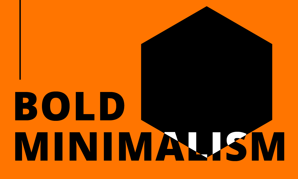
Minimalism is like that classic white shirt, it’s never going out of style. This “less is more” philosophy has been gaining even more prominence in 2025. Think uncluttered designs characterized by clean lines, sharp text, and lots of breathing room. With its limited colors and focus on fonts, every design element serves a purpose, stripping away the unnecessary to make your message clear, concise, and compelling.
AI Design
Whether you’ve embraced Artificial Intelligence with open arms or just think it’s an overhyped gimmick, one thing’s for sure: you can’t ignore the impact it’s had on graphic design this past year. Sure, AI still has kinks to iron out. However, it’s already worked its way into most mainstream design apps and software programs. Chances are it’s here to stay. It’s a fast, easy way to generate images, portraits, patterns, layouts, and more.
70’s Nostalgia
We’re witnessing a comeback of the iconic styles from the ’60s and ’70s in graphic design. Think faded color palettes, retro stripes, checkers, florals, and other funky patterns that evoke the nostalgia of the second turning. And let’s not kid ourselves: after a year filled with technological leaps like AI, it’s refreshing to draw inspiration from simpler times, infusing a bit of retro charm into our designs.
3D Bubble Text
Don’t be surprised to see an upsurge in 3D type, particularly “bubble text,” throughout 2025. This design element injects a sense of fun and vibrancy into your work and has gradually become more popular in recent years, especially when paired with dynamic 3D animations.
Doodles
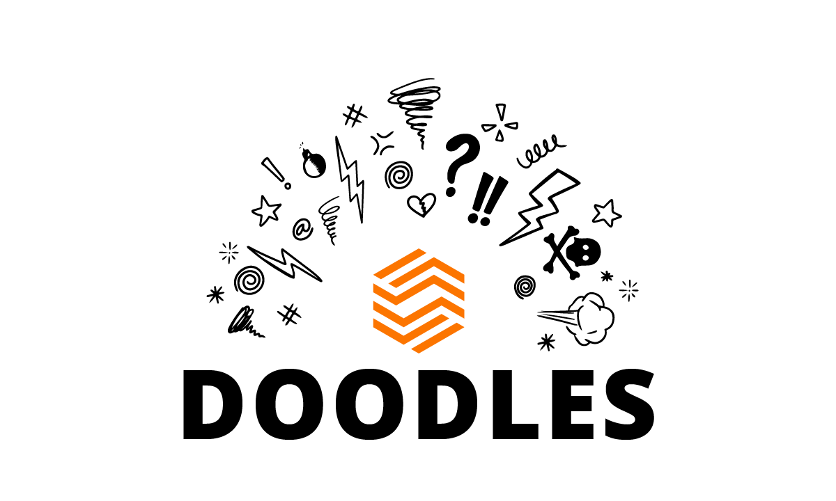
The hand-drawn doodles trend in graphic design also referred to as hand-drawn art, adds a “human” touch to your brand image. The theory is handcrafted elements resonate more with your audience, which helps position your client as warm and approachable.
Texture
In 2025, we’ll be seeing a whole lot more texture in graphic design, as studies show this helps connect with the viewer on a deeper level, appealing to senses like touch, taste, and feel.
Quiet Luxury
The concept of quiet luxury (no bling, no logos) took the fashion world by storm in 2023. And now, this trend is now making its way into graphic design. It’s the perfect strategy for marketing high-end products to an affluent customer base. The main thing to keep in mind? Less is more. The product itself should do all the talking.
Condensed Serif Fonts
Often used in quiet-luxury designs, condensed serif typefaces evoke a subtle, “old-money” feel—without veering into full retro territory. It’s a versatile choice for your minimalist projects too, perfect for branding, website designs, social images, and product packaging.
Retro Pixels
Once synonymous with old-school video games like Pac-Man, pixels have seen a new resurgence in web design, animation, and illustration. These square, 8-bit building blocks are a great choice when you want to blend past and present.
Less Geometric, More “Fluid” Shapes

Every day, graphic design moves farther away from rigid geometric shapes. Instead, fluid and abstract forms are becoming the “standard.” Curves and organic shapes are supplanting straight lines. In a nod to tech-centric graphic design trends, there’s a growing preference for soft, puffy surfaces.
Use the Latest Graphic Design Trends to Capture Your Target Audience
Leveraging the latest design trends isn’t about “looking good.” It’s about staying relevant and resonating with your audience in our rapidly evolving digital world. Enter Timmermann Group. Our graphic designers don’t follow trends, they pioneer them. Whether you’re in need of captivating logos, eye-catching corporate signage, engaging social graphics, or polished corporate literature, you’re not just getting a graphic design service—you’re getting a team dedicated to bringing your brand’s vision to life with creativity, innovation, and style.