Top 10 Must-Have Website Features
Building a new website and picking out the perfect website features to include can be an exciting process. But as is the case with any major investment in the future of your business or organization, it can also be a little nerve wracking. Coming up with an attractive and functional web design that is everything to everyone (and that stays under budget) is a major undertaking and not something you’re going to decide on a whim or complete in a week.
Your website, when complete, is going to be one of a kind. It’s going to uniquely tell your story, enhance your brand, and inspire your customers to take action. There are no cookie cutter plans or one-size-fits-all solutions when it comes to website design (that’s part of what makes it so much fun!) All that being said, building a new website is a lot of work and requires thoughtful planning, collaboration, strategy, and plenty of back and forth between all parties involved.
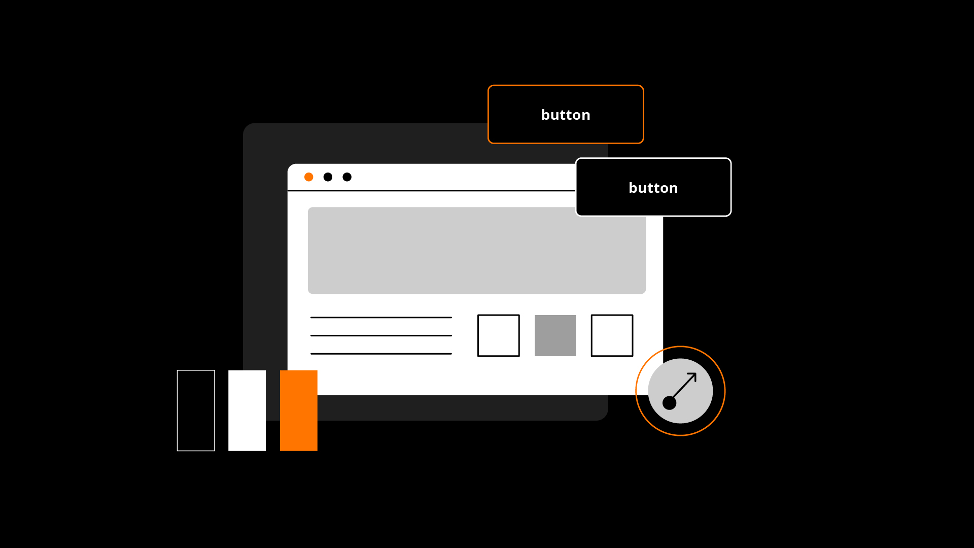
10 Primary Features of an Effective Website
Think about how your website functions. It’s important to have a general sense of what you want out of your website and the features it needs to have. A web design agency worth your time and investment will be able to walk you through what they feel are the most critical of website features, but you’re still going to have plenty of flexibility and decisions to make throughout the process. Some of the tips your agency recommends will probably be pretty obvious and others not so much. But the more you can research ahead of time, the better prepared you’ll be to have these discussions when they come up.
If this is your first time spearheading a company website redesign project, don’t worry. It’s probably not nearly as bad as you’re fearing and your agency will be there to support you from start to finish. And just to get the wheels turning, we’ve compiled a list of top 10 website features your website can’t be without. It’s not a complete list, mind you, but we hope it’ll give you a little background as far as what to expect.
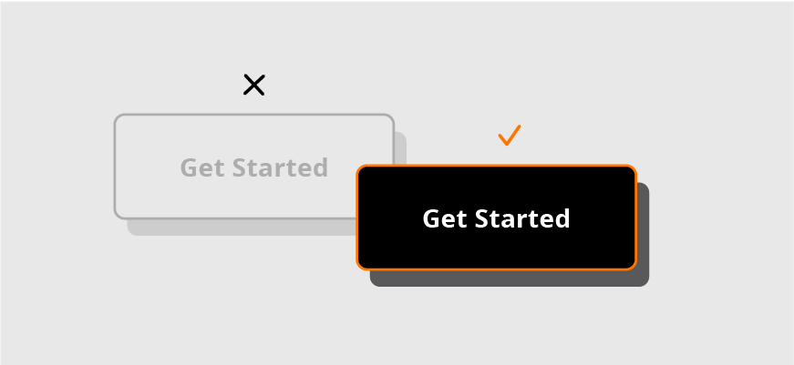
Utilize Clear CTAs
When a prospective customer visits your site, what do you hope they get out of it? If they scroll for a few seconds, then bounce, are they helping your bottom line? Of course not. By designing and implementing clear cut calls to action, you’re effectively capturing the interest of your site visitors and guiding them through the buying process.

Make It Mobile Friendly
Honestly, if your agency of choice isn’t 100 percent committed to giving you a responsive site designed with a “mobile first” mentality, then it’s probably time to find a new agency. Most of your website’s traffic is going to come from mobile devices and you need to be confident that your visitors are getting the information they need quickly and easily regardless of device. Furthermore, a responsive design will help your site in terms of SEO, making it much easier for new leads and customers to find your site by way of major search engines. Responsive design isn’t just a tip, it’s a necessity.
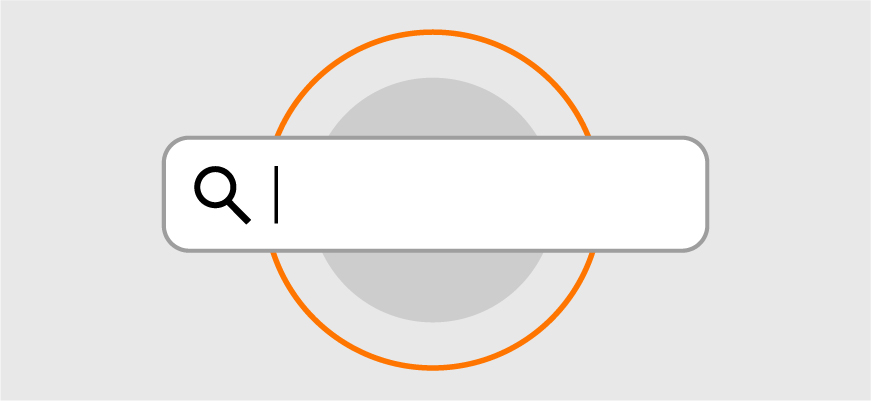
Prioritize SEO
And speaking of SEO, you’ll want to make sure that your agency has a firm grasp not only on the nature of your business and the needs of your target audience, but how to use SEO to ensure your site gets noticed by Google as well. Ideally handled in-house by your agency rather than outsourced, SEO should be a key priority throughout every step of your website build. Your content plan, copy, photos, videos, crosslinks and everything else that goes into your site should be done with SEO in mind. It’s always best to implement an effective SEO strategy from the beginning rather than try to play catch-up later on.

Show, Don’t Tell
It’s not enough to tell your customers who you are and what sets you apart, you have to show them. You can lay claim that your products are the best in the business all you want, but chances are your prospective customers will want to see proof. By blending the right graphic design elements, visual media, and captivating content, your website can effectively illustrate exactly what differentiates you from your competition.
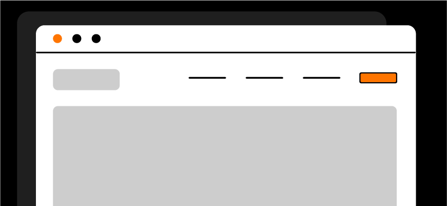
Use Simple or Intuitive Navigation
This is one area where you’ll want to walk a very fine line between “too standard” and “too out of the box”. While you want your website to be different and really stand out to your visitors, you also need to be sure that your navigation makes sense. Your visitors are accustomed to certain baselines when it comes to site navigation, and if you stray too far from from that idea without offering direction or clarification, you could risk losing visitors.
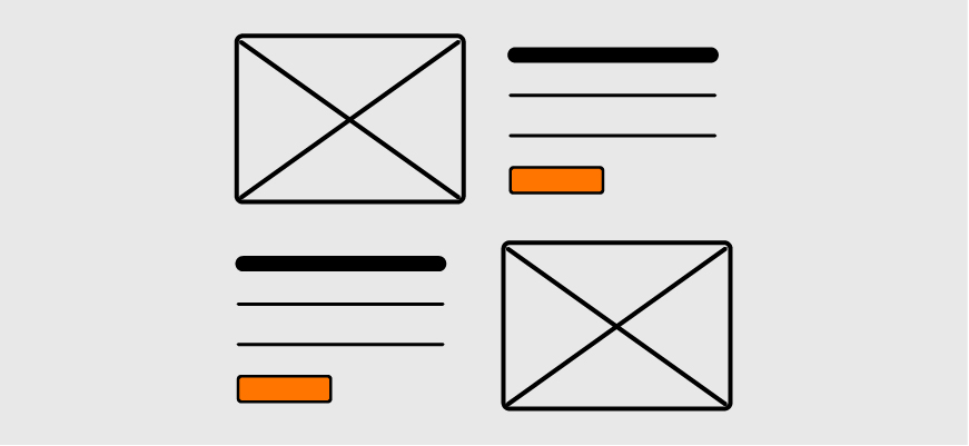
Utilize Bite-Size Content
This is more than just “writing less” (though we’ll get into that too). Utilizing bite-size content deals more with the organization and visual layout of your content, and not the word count specifically. Your content needs to be broken into “easily digestible” segments that flow; not a heavy block of black on white text that may bury key information.
Make it ADA Compliant
Your website needs to be accessible and navigable to everybody, regardless of disabilities or ailments that might make web browsing more difficult. When building your site, you need to stay on top of every variable that might prevent someone from being able to use your site properly: color contrast, embedded media, image alt text, screen reader capability, and plenty more can render your site inoperable for certain visitors. Make sure your agency is up to date with the latest ADA requirements and best practices.

Prioritize Concise, Quality Content
When it comes to producing quality content marketing, less is more. In most cases, your site visitors are looking for clear and concise answers to their questions and endless blocks of text can be a major turn-off. While exceptions can be made for more in-depth areas of your site, you’re going to want to make sure that your main landing page content is to the point and leaves a lasting impression.
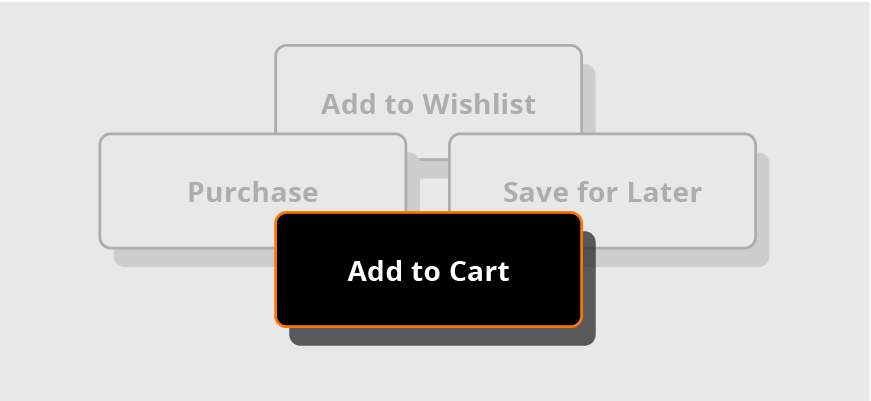
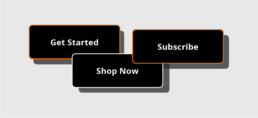
Once You Find Your CTA, Stick With It
It’s important that as people browse your site, that they are presented with CTAs that make sense and reinforce familiarity. For instance, on every Amazon product page, the user is presented with familiar orange and yellow buttons labeled “Add to Cart” or “Buy Now”. Not “Save for Later”, “Make a Purchase”, “Add to Wishlist” or anything like that. If your messaging and preferred course of action are constant, your CTAs need to be as well.

Keep page load speed down
Is there anything more frustrating than a site that takes forever to load? Your site needs to convey your message and brand in an effective and fashionable way, but needs to do so within certain limitations. Adding too many videos, animations, or high-resolution images can bog down your site, drive visitors away, and crush your SEO capabilities.
Conclusion
Embarking on a website redesign project is a big step, and there is a lot to keep in mind as you venture down that path. There is so much more to decide than just content and color schemes. And because the process can be so involved and complicated, we always suggest having an experienced web design agency in your corner to help you decide the components and features that will most effectively get your brand’s message across. If you should be interested in optimizing your online presence with any of these effective website features, contact us today.