Midwest BankCentre
Midwest BankCentre has been the premier community bank for the St. Louis area since 1906. As a community bank, Midwest BankCentre prides itself on its investment in the St. Louis community, with multiple initiatives focused on building up local families and businesses, lifting the regional economy and the residents of St. Louis one customer and one transaction at a time.
Challenge
Every year, Midwest BankCentre issues an annual print report that showcases their work in the community, highlighting specific members and testimonials, employee stories, community building efforts and other news and events of the year, weaving in the bank’s specific efforts to invest in residents and local businesses and incorporating impactful data regarding those efforts. The Midwest BankCentre team came to us looking to streamline and simplify their current report format, as well as make it more visually interesting, hoping that members and other people in the community will be more enticed to pick up and read the report when they see copies of it in BankCentre lobbies and elsewhere.
Takeaways
We knew from the start that Midwest BankCentre’s community report wasn’t just any corporate or annual report. This initiative is one of the most important marketing assets they create every year, and one they clearly treasure and hold dear. We were thrilled to help them elevate what was an already vital marketing asset to something even greater—helping them reach new heights, just like they do every day for their members and this community that we all share.
How TG helped
Our goals in taking on this project for Midwest BankCentre were to help them construct an improved content strategy for the report, as well as design new visuals that made the report look cohesive and fun to read, folding in their updated branding visuals and messaging focused on helping St. Louis “rise together” as a community.
- Revised Content Strategy
- Updated Visual Design
- Branded Social Media
- Digital Assets
- Environmental Design
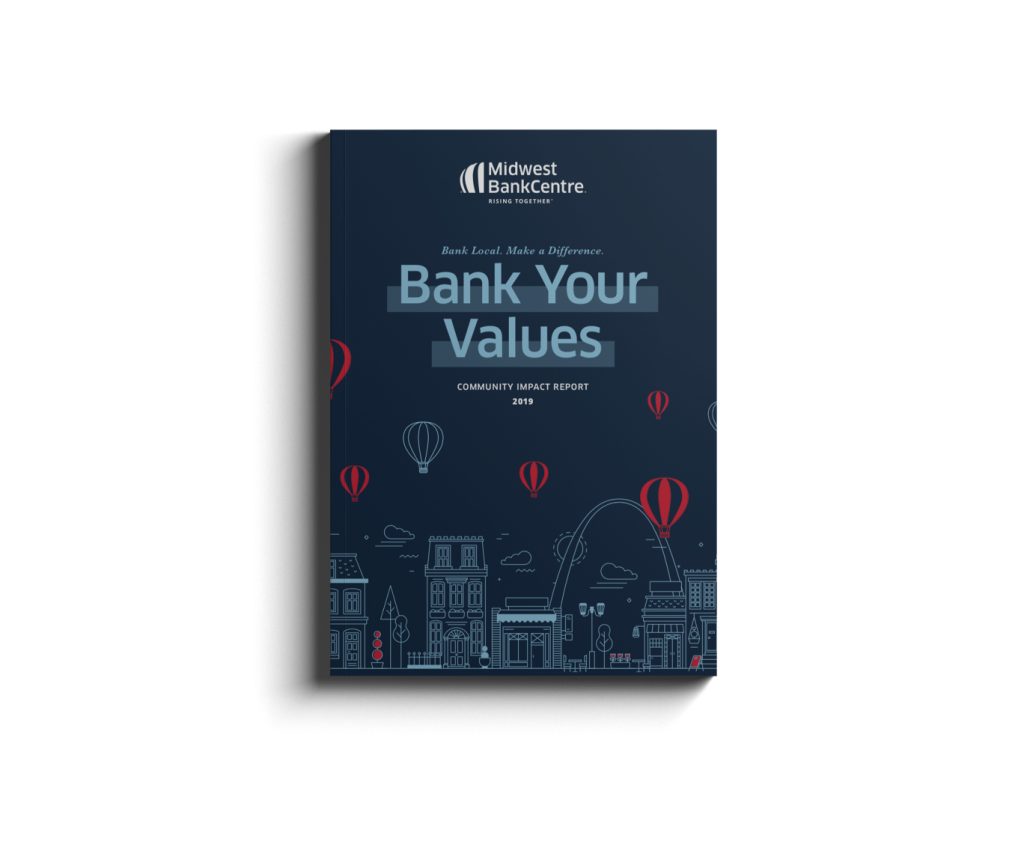
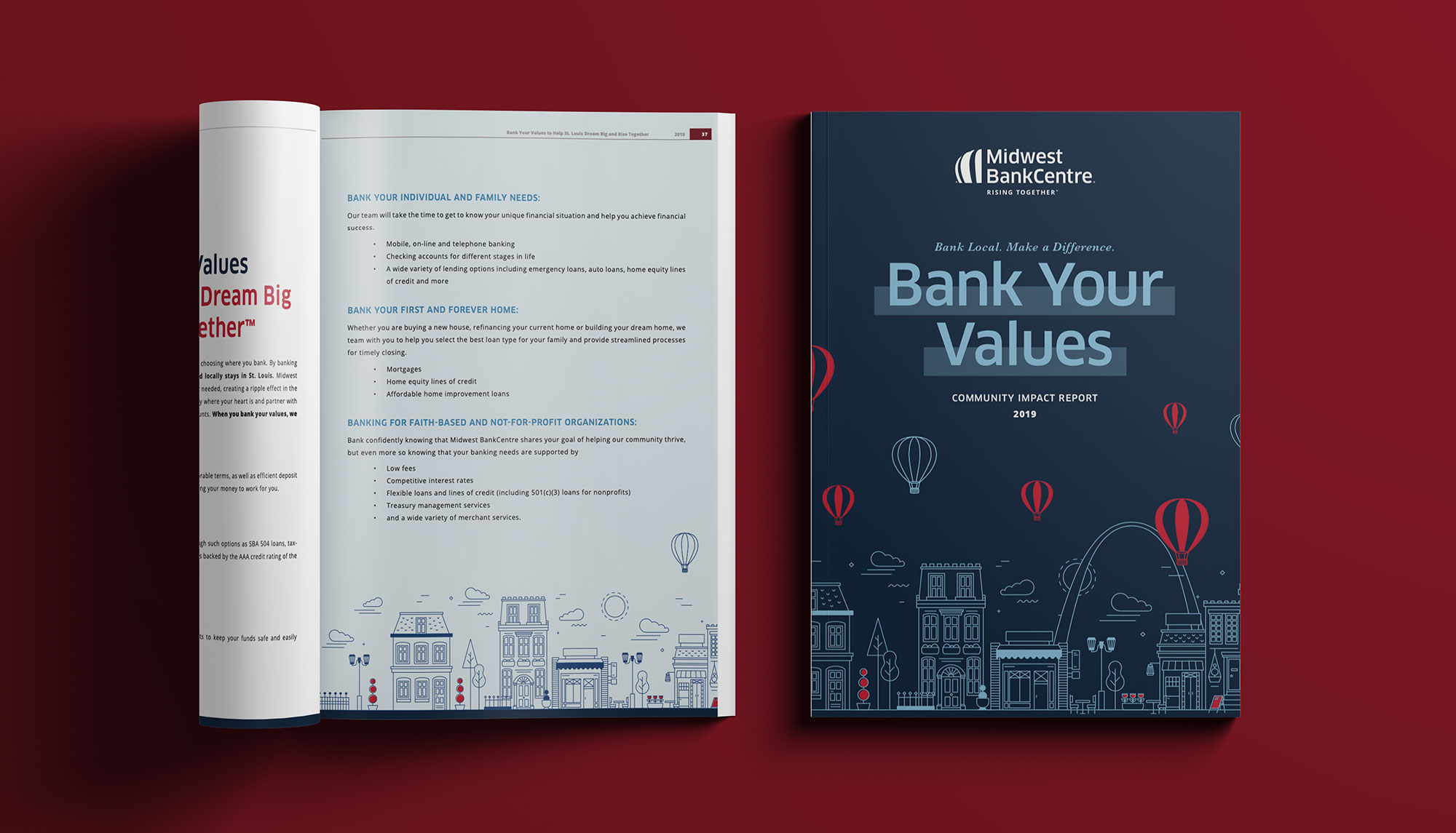
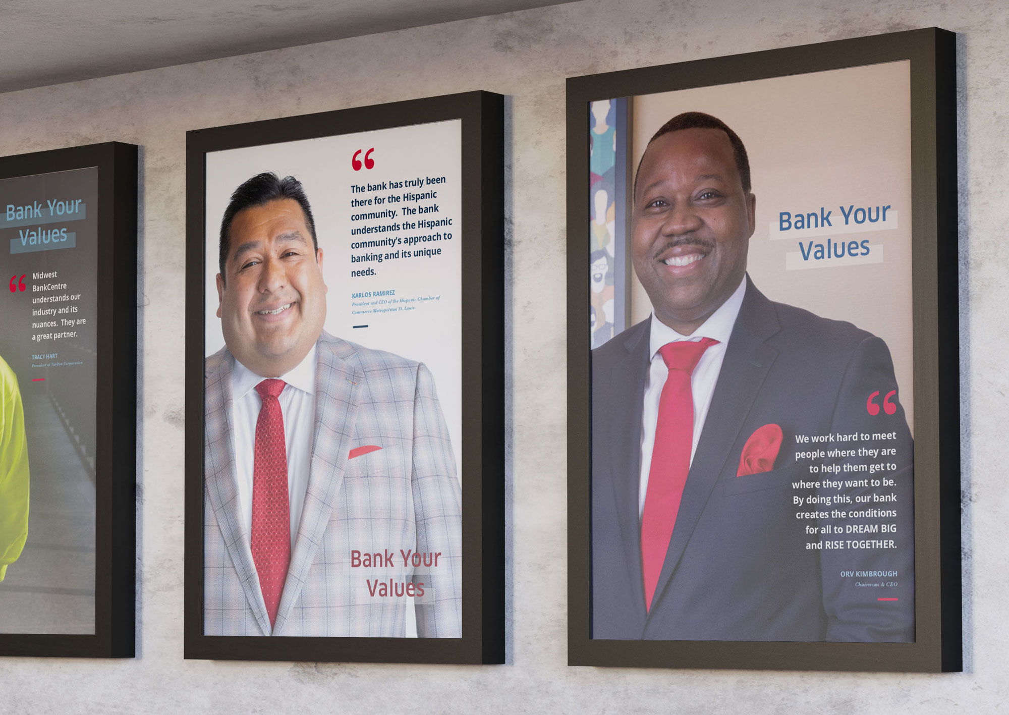
Updated Visual Design
Updating the visual design was the chief element of our work on the revised community report. In addition to creating a more visually appealing and unified report, we incorporated pieces of the bank’s updated branding and messaging, refining the brand colors and typefaces and featured the bank’s photography assets. We created new icons and illustrations to help add visual interest to every page and draw readers’ attention to specific elements, quotes and pieces of data.
Revised Content Strategy
Past editions of the community report included lengthy articles and copy, hard-to-read data and disjointed storytelling. For this edition, we worked closely with the Midwest BankCentre team to put together the content strategy, focusing on streamlined storytelling, clear links between the content types and stories and pulling out significant pieces of data in a visually interesting way. The end result is a piece that can be read cover to cover or in pieces, each segment standing strong on its own or as a part of the cohesive story of Midwest BankCentre, its members, its employees and its community.
Branded Social Media
As a social media marketing agency, we also updated the bank’s social media cover images and created templates for social media graphics that utilized the new assets, colors and fonts. In creating these new social media assets, we continued to help the bank establish consistent branding that was cohesive with the look of the community impact report.
Digital Assets
In addition to the new social media images, we created supplemental images that were consistent with the look of the community impact report for use in other digital spaces, including display and programmatic ads, as well as images for their NetTeller online banking system.
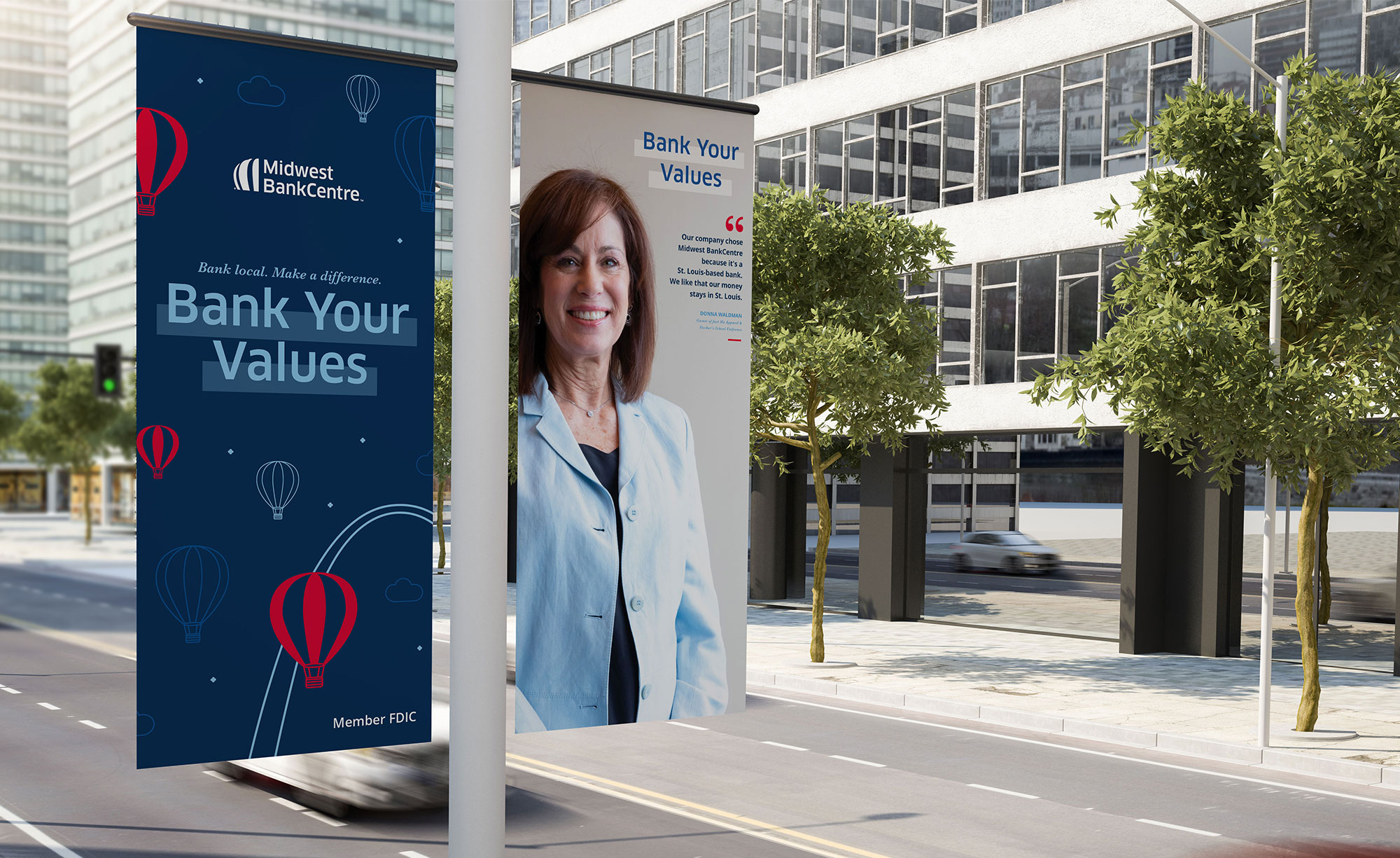
Environmental Design
Our work to create additional cohesive visual elements for Midwest BankCentre didn’t just extend to the bank’s reach online. We also created assets to promote the bank, the report and its mission in other environmental and physical spaces in addition to the physical copies of the report itself. We crafted updated visual assets for the bank’s desk mats, drive-thru posters and images and banners for digital and TV screens in the bank locations, as well as lobby posters. Together, these assets create additional opportunities for the bank’s users to visually familiarize themselves with this new branding and messaging, creating visual markers that generate recognition and interest in the report itself, encouraging users to pick up a copy of the entire report.
Results
The end result of our collaboration with Midwest BankCentre is the new and improved community report they were looking for. The report is visually stunning, engaging and informative, well-constructed and well-written. But don’t just take our (or their) word for it: The report was also recognized by the Graphic Design USA awards in their annual and community report category. Our primary goal with our work is always to satisfy the needs of our clients and their audiences, but it never hurts to be recognized beyond those metrics.
-

Graphic Design USA Award
Annual & Community Report