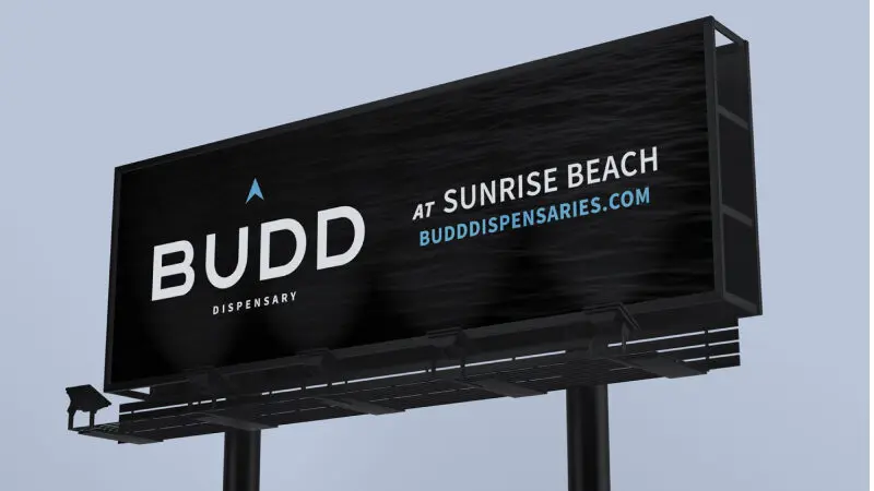
Missouri Wild Alchemy Success Story
Missouri Wild Alchemy is a small, local and family-owned medical cannabis dispensary. The team at Missouri Wild Alchemy, above all else, values their role as a provider of accessible, warm and professional health care with a focus on alternative and holistic health services. Their goal is to not only provide patients with high quality products, but also friendly service and vital education.
Challenge
Missouri Wild Alchemy was looking for a new brand style and logo redesign that better fit their approach and mission after their previous logo did not meet specific requirements established by the state of Missouri for medical cannabis providers. They wanted the new visual representation for their brand to be in line with these established guidelines while still communicating their perspective, calling attention to and establishing trust in their services and products for current and potential customers.
Takeaways
Whether your branding is governed by state law or not, it’s important to get it right. Branding isn’t just about a customer’s first impressions. It can help determine whether or not they’re interested in learning more beyond that first impression. It helps build recognition and space for them to remember and refer your business to others, and to keep coming back for themselves. Especially in a crowded field, it can be your only opportunity to break away from the competition.
How TG Helped
Missouri Wild Alchemy engaged Timmermann Group, a cannabis marketing agency, to produce a new logo design concept and brand style guide that established the brand’s standards for font and color use for print materials and web. While it’s a focus of ours for any client project, being in the healthcare marketing strategy space, it was especially important that these new brand materials were ADA compliant.
- Research and Discovery
- Logo Design
- Branding
- Brand Style Guide
- Brand Implementation
Research and Discovery
Our process began as it usually does: with stakeholder interviews and research. We knew that, being a medical cannabis dispensary, the new branding had to carefully avoid using certain explicit medical imagery and language as governed by local laws. The branding had to walk a specific tightrope: establish Missouri Wild Alchemy as a trusted, empirical healthcare provider without being so explicitly medical that it went against the state’s guidelines. In our stakeholder interviews, the team described a desired visual effect that was “modern, magical and a little creepy” and an “1860s bank meets Harry Potter.”
Logo Design
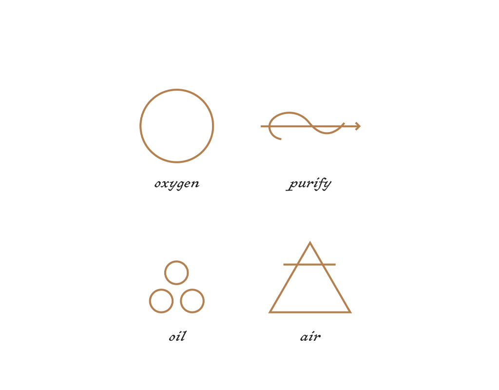
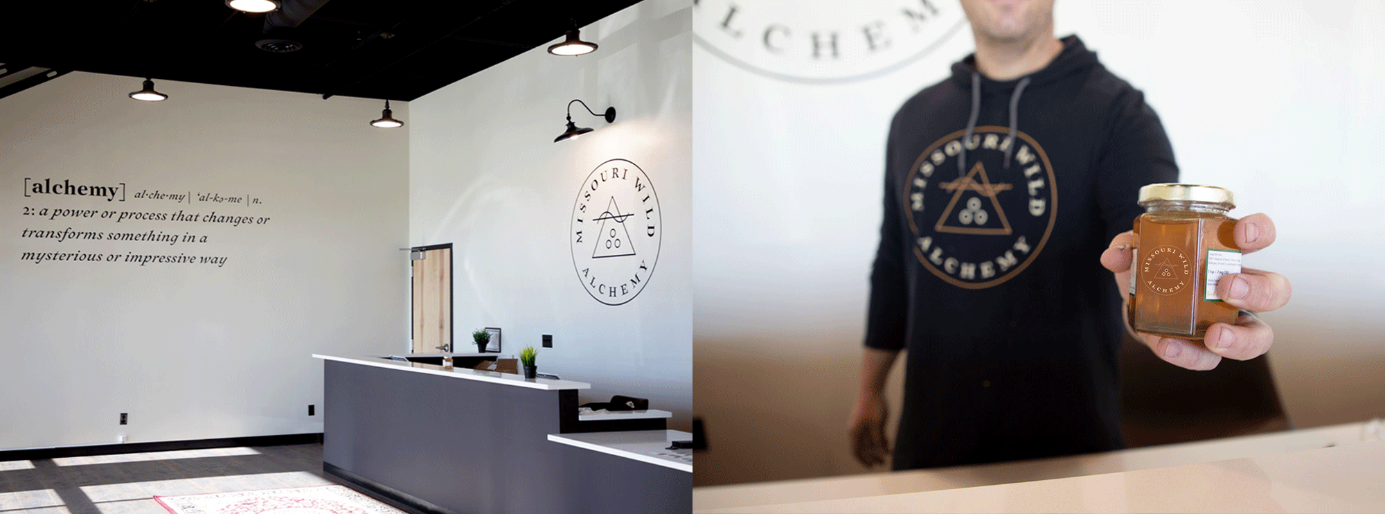
To avoid the issues they’d had with their previous logo, we focused on a more abstract approach that was clean and modern, with linework that resembled the elements of oil, air, oxygen and purification.
Branding
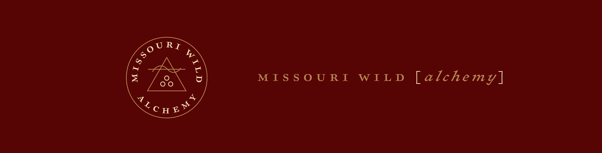
The modern and delicate logo we created, along with additional detailed and intricate illustration, was juxtaposed with dark, rich colors and fonts. The balancing of these two concepts creates a visual look that achieves their desired effect: something a little magical and fantasy-like, but still warm, comforting and mysterious.
Brand Style Guide
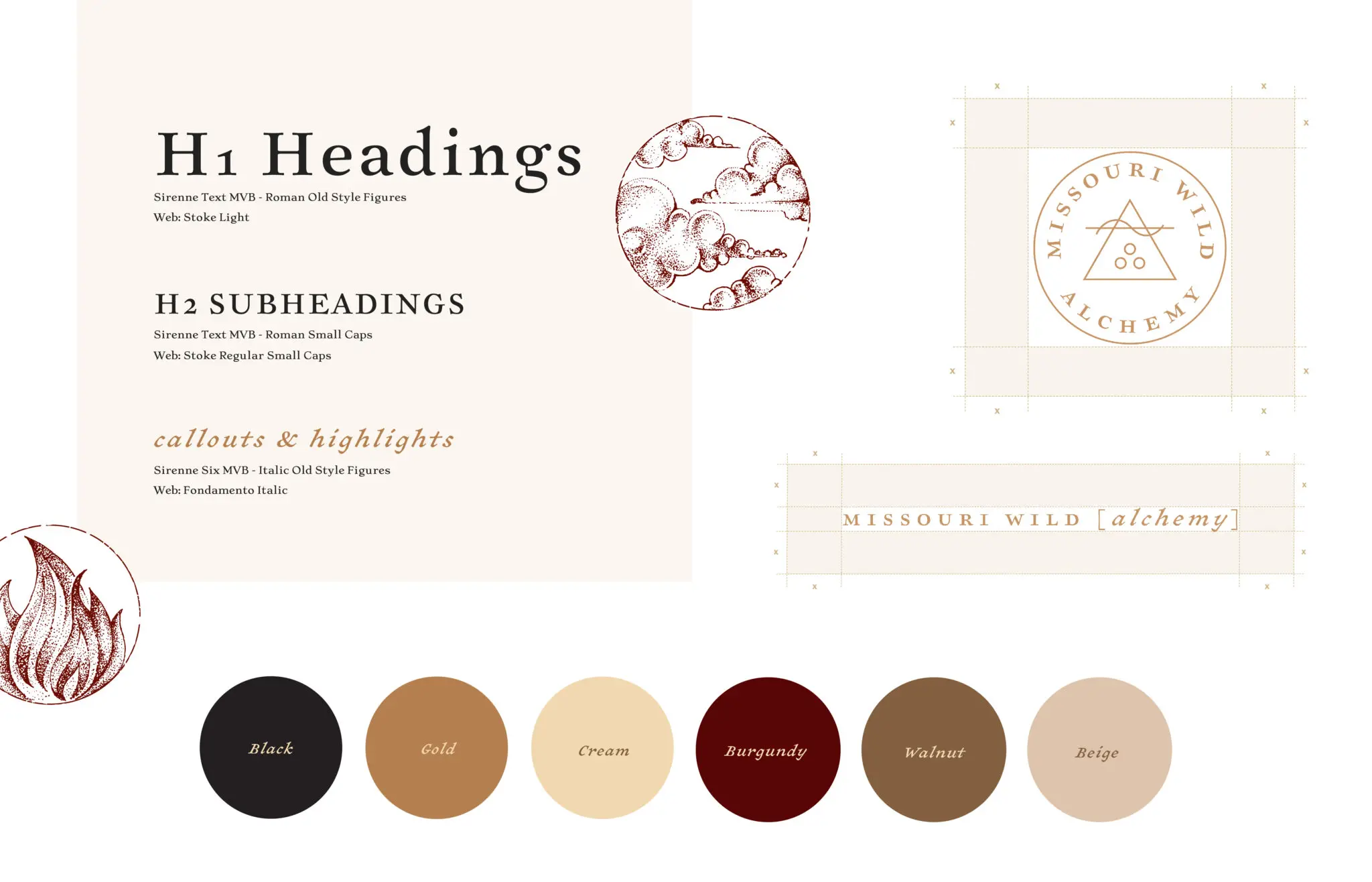
In order to help the team at Missouri Wild Alchemy utilize their new logo and brand design, we created a brand style guide. In the guide, we give their team essential governance and usage guidelines for their logo, including additional logo versions and colors, as well as established typefaces, colors and their uses.
Brand Implementation
From the creation of their new logos and branding, Missouri Wild Alchemy was able to outfit their staff and retail space to match, ensuring their branding is consistent online, in print and in person. This cohesive visual identity is essential to help establish brand recognition and trust with customers and potential customers, a crucial element for any business, but especially a new one in a crowded marketplace.
Results
-

The end result of our work for Missouri Wild Alchemy is one that their team loves, and ours, too. (And, more importantly, it’s one that the state of Missouri doesn’t take issue with.) We successfully drew from the client’s desired look, the inspiration they provided and their values as a business to create something special that will help establish and grow their business.
-
Graphic Design USA Award
Special Category: CBD + Cannabis